Hello 2019!
Halfway into the first month, and a lot has already happened in the branding world. MasterCard has dropped its name from their logo for the first time in 50 years. The co-working giant, WeWork has rebranded as The We Company. And Pepsi jumps on the love wagon with their new rebranded campaign – For the love of it (How I love these Cola wars). Looking back at 2018, it was definitely the year of rebranding.
But it was also the year of temporary branding. Was it a change in an identity for a cause? Or simply, another marketing stunt? Let’s take a look at why some of these brands hijacked their logos.
1. Coca Cola
Let’s start this listicle with a brand that makes everyone happy. Seriously though, they should be crowned the Kings of Emotional Advertising. Hearing a Coke bottled being opened is everything – it makes you want to taste the happiness.
A) Share a Coke
Initially known as ‘Project Connect’ – this campaign was started way back in 2011 in Australia. It was aimed at bonding with Australia’s young adults, while also inspiring sharing of happy moments in both real and virtual worlds. The idea was to put the most common names of the Australian people on the face of millions of coke bottles. Coke ditched its name for its consumers’ names. This struck a chord with Coke fans world over, further deepening bonds with people and the brand itself. Coke went onto sell more than 250 million named bottles and cans that summer down under, for a population of 23 million.
You can read more about how Share-A-Coke came to be here.
 A) CokexAdobexYou
At the Adobe Max 2017, Adobe announced that they were partnering with Coca Cola to launch a global contest, CokexAdobexYou; ahead of the 2020 Tokyo Olympics. Celebrating sport, movement and strength, CokexAdobexYou invited people to remaster Coke’s brand assets using Adobe CC into artworks celebrating the same.
Can’t wait for 2020 to see who wins the challenge!

2. IHOP
IHOP faked a name change – IHOB. IHOP needed a campaign that was creative and something that lured customers to try out their new menu. What they didn’t expect was a whole controversy surrounding their name change. There was a lot of speculation of what the ‘B’ in IHOB stood for. Bacon, breakfast, burritos, bananas? I thought it was to cater to the Middle Eastern fans (Why? Because there is no ‘P’ in Arabic!)
We were all wrong. From International House of Pancakes to International House of Burgers. They had changed their name to promote their new burger lineup. This sent fans into a frenzy and they received a lot of backlash for it.
But on the bright side, their sales quadrupled that quarter. And they’ve switched back to IHOP, while still making crazy sales on burgers and pancakes.

3. KFC
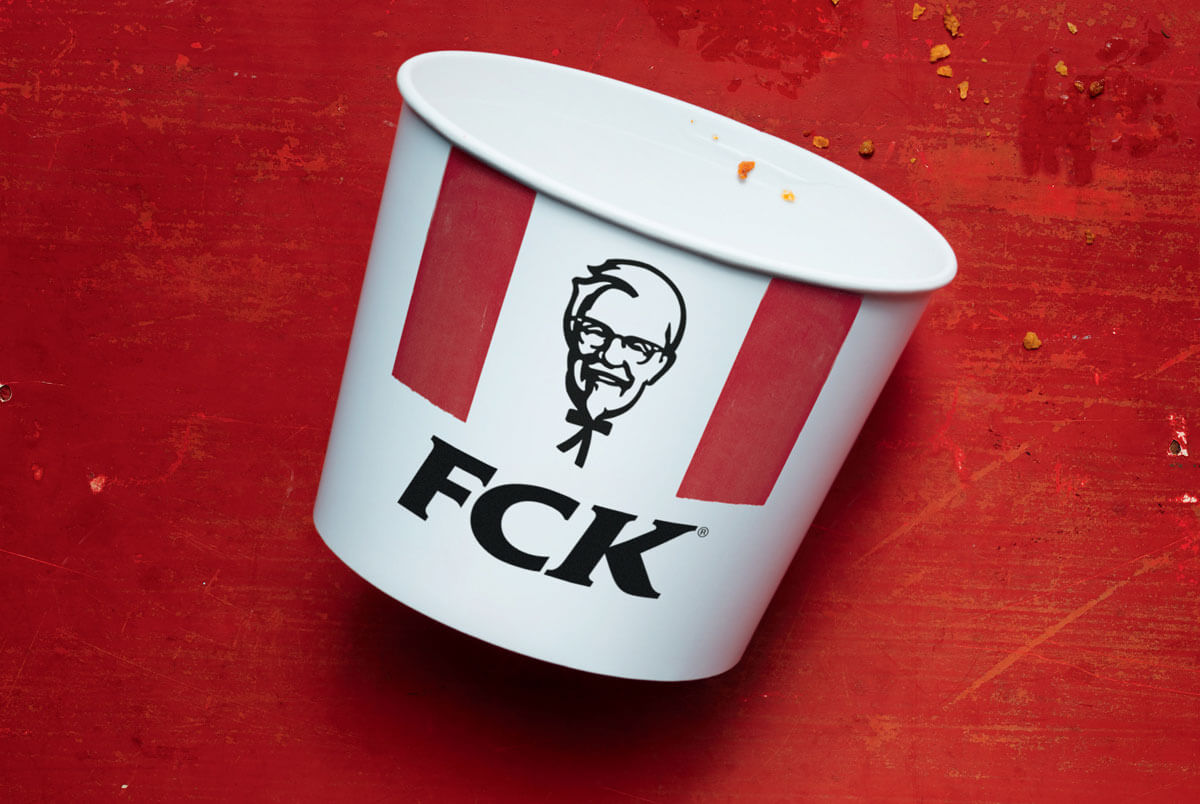
A mess up in the UK. A smart arrangement of letters to make a statement. So humble, yet so creative!
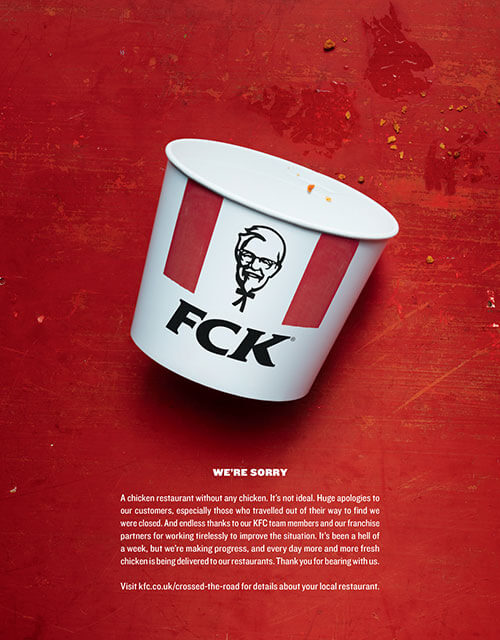 Interestingly enough, People in Japan are obsessed with KFC. The obsession is real – they go to the lengths of ordering their Christmas Dinner 2 months ahead. Makes me wonder what would happen if they ran out of chicken then? They probably would have to change Colonel Sanders to The Grinch.
4. Lacoste – Save Our Species
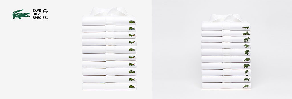
For the first time in 85 years, this French brand changed its iconic logo to raise awareness for the endangered species of the world.
Lacoste collaborated with the International Union for Conservation of Nature (IUCN) to deliver one polo shirt for every one of the threatened creatures. The famous crocodile bowed down to make way to 10 other animals, namely – The Vaquita, The Burmese Roofed Turtle, The Northern Sportive Lemur, The Javan Rhino, The Cao-vit Gibbon, The Kakapo, The Californian Condor, The Saola, The Sumatran Tiger and The Anegada Ground Iguana, on a set of limited edition white polo shirts.
What a bold, yet thoughtful move!
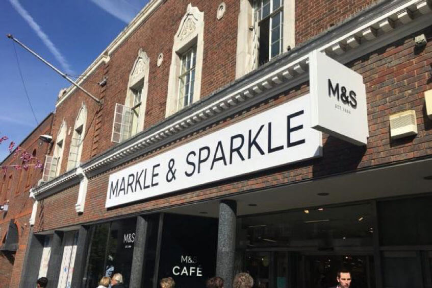
5. Marks & Spencer – Markle & Sparkle
May 2018 was all about The Royal Wedding. Rebranded only for a weekend for the wedding of Prince Harry and Meghan Markle. Markle & Sparkle decked their stores with Royal themed products to encourage customers to undertake their own Royal and magical festivities and dream big.
6. Waitrose
This one is minimal and cleverly crafted.

7. International Women’s Day
March 8 2018 will go down in history as the day the world rebranded to honour the Women of the World. It is said that 89.5% of design directors are male, which is probably why most brands contain male characters. Here are a few notable brands that got a makeover on International Women’s Day!

8. Bonus – Google Doodles
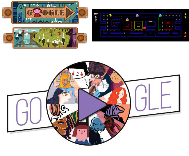
This has to be the most obvious one on the list, but is probably the last brand you’d think of. Google has been playing with its logo since the very beginning. It became a thing after the founders Larry Page and Sergery Brin added a stick figure to the ‘O’ in ‘Google’ to show that they were at The Burning Man Festival.
 Ever since then, Google has been collaborating with artists to create doodles for different events, causes, public holidays or even famous birthdays. Their doodles are quite quirky – some incorporate interactive videos, games and music! You can check out all of them right here.
 With this, we come to the end of this little listicle. Do let us know if you know any more brands that have modified their logos for a particular event. Maybe someday we shall rebrand Yellow to Pink. Or Black. Maybe.
Signing off,
Ash
