Who We Are

We Are -
An extension of your team. The outside perspective you need. Insightful, effective and nice (an underrated but very important quality). The perfect blend of strategy, art, imagination, impeccable taste and a sprinkle of magic.
Great thinkers and even better doers. Huge fans of work-life balance. Namers, strategists, designers, researchers, artists, partners, terrible but enthusiastic singers.

We Aren't -
Able to work for free - got bills to pay, y'all! Complicated, stuffy and full of unhelpful jargon. Specialised in PR / Events / Media / Web Development - but we can always connect you with them. Know-it-alls.
The kind of consultants that prepare a 100 slide deck with no substance. 'Your suppliers', we are your partners. Bureaucratic and slow to move and react.

Our Values
Internal culture and our team is our greatest asset. We are intentional about our values of:
Wellness

Wellness
Mental, Emotional and Physical wellness are not just appreciated within Yellow, but encouraged with policies in place. Mental health days - we have them. Participation in Dubai Run - we do it. Steps challenge - check.
Curiosity
Curiosity
Love for learning is a core value of Yellow. We are not intimidated by advancements in trends, AI and technology, we embrace it and we play and learn, and more importantly, we share it with our team and clients.
Team Work

Team Work
We prioritise collaboration and helpfulness, internally and with clients, and we like to go the extra mile. Yellow was started out of passion and purpose over profit - although, we like profit too. :)
Meet the people
We grow amazing companies through exceptional branding and communications.


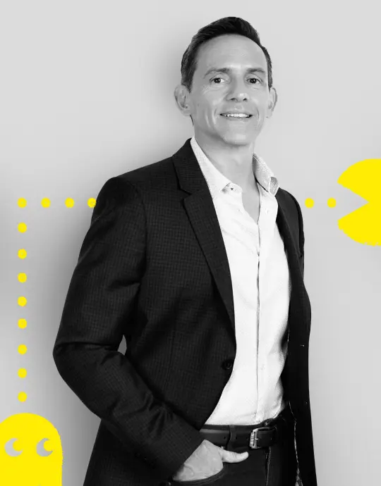
Wael Bittar
Communication Director


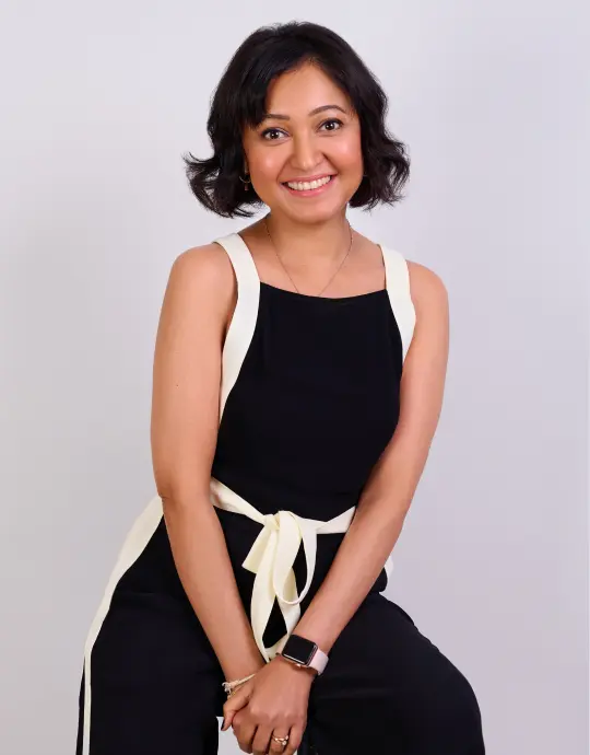
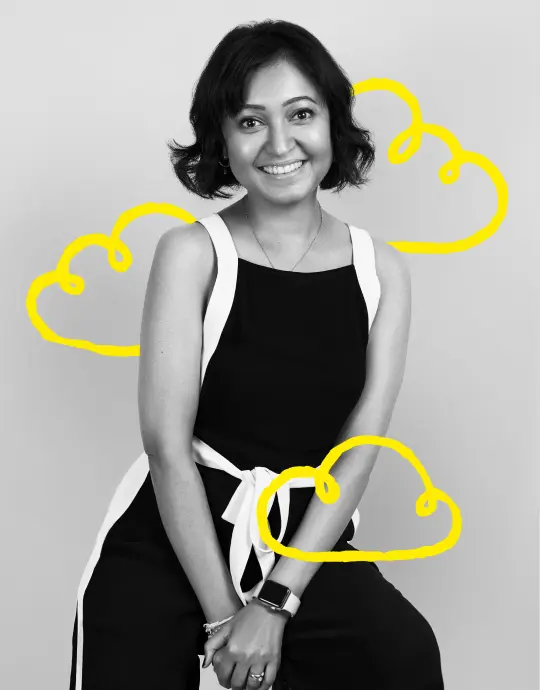
Mamta Varerkar
General Manager

Stuart Harris
Creative Director
Sarah Azmi
Head of Strategy


Maritony Flores
Office Manager


Youmna Kanaan
Senior Creative Lead


Sweatha Monichen
Senior Account Manager

Du Toit Griesel
Account Manager


Arwa Manager
Account Manager


Zeina Ghoufran
Senior Account Executive
Aishwarya Carriappa
Lead Interactive Designer


Gunjan Mathur
Brand Designer

Joyce Abbo
Art Director

Jay Gado
Motion Graphics Designer
Join Yellow and Make a Difference.

Our Work
We grow amazing companies through exceptional branding and communications.


