Ned Properties
Brand Strategy
brand identity
2024
The brief
visual language
Brand Strategy
brand identity
Yellow was tasked with rebranding Ned properties in the region. Ned properties required a single-minded focus and an identity that differentiated itself from the cluttered real estate market.
Client
Ned Properties
Industry
Real Estate

The insight
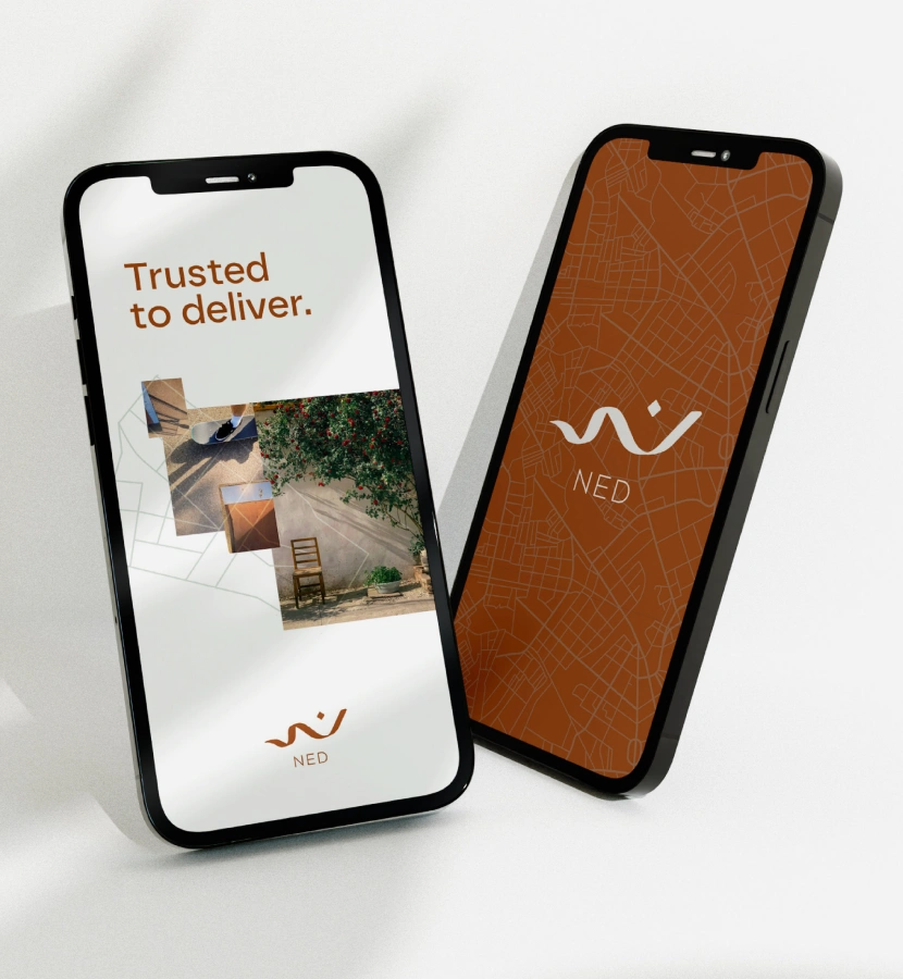
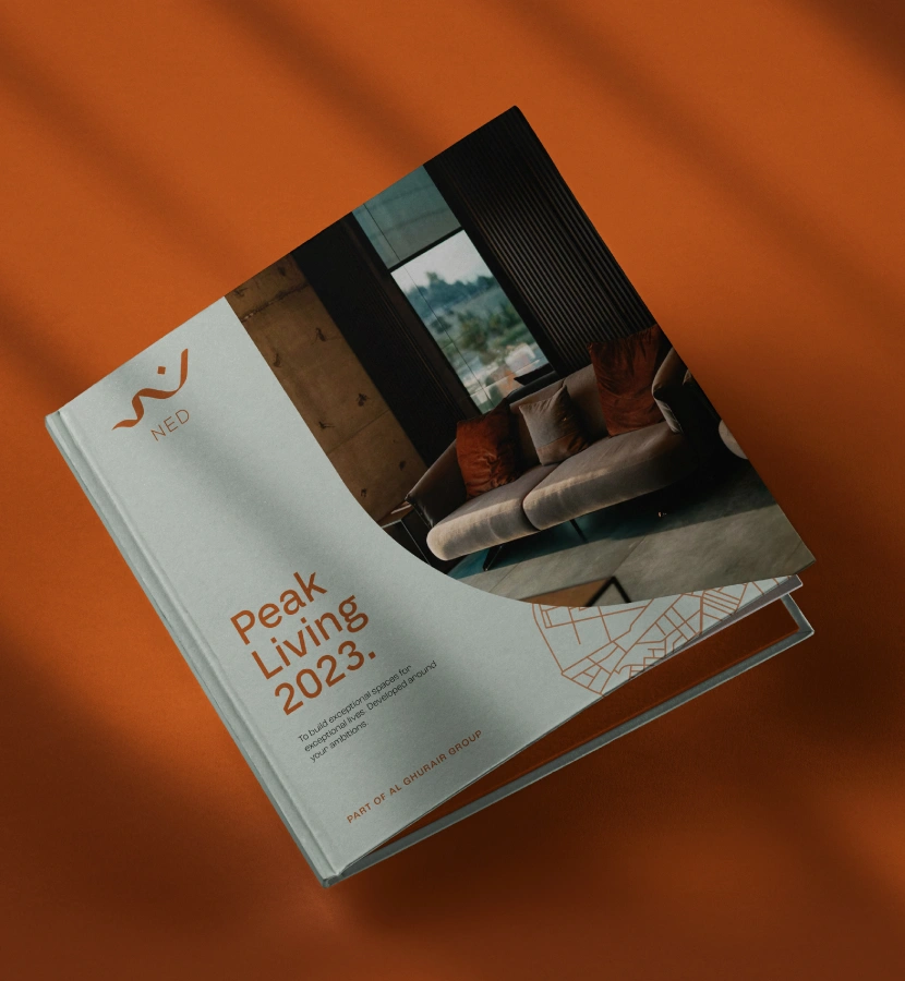
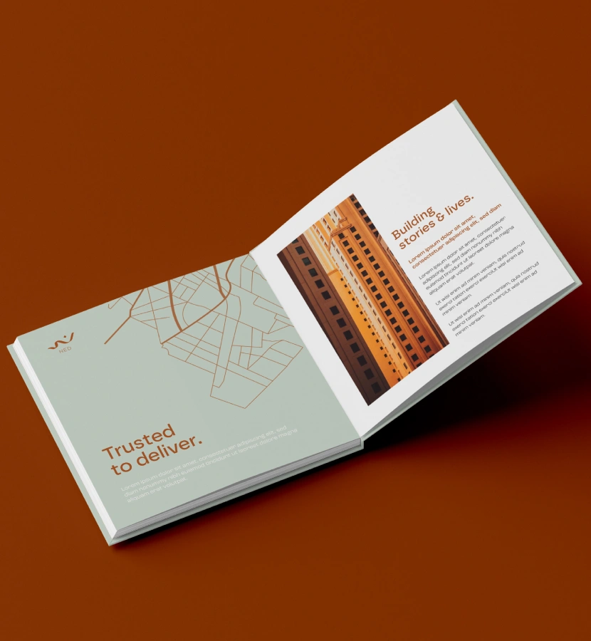
We reviewed the properties within Ned properties and what was coming up in the pipeline to craft a compelling strategy focused on delivering exceptional spaces for exceptional living. We also wanted to highlight their attention to detail within the identity and visual language.


The approach
We brought the brand to life by taking colour inspiration from the sand dunes of the region, as well as the organic shapes of these dunes coming through in the wordmark. While all other real estate companies opted for a Serif, all-caps wordmark to establish authority, we positioned Ned properties as more organic and agile – giving it true stand-out appeal compared to everything else out there in the market.


