Barakat Froza
Packaging
brand identity
2024
The brief
Packaging
brand identity
The insight
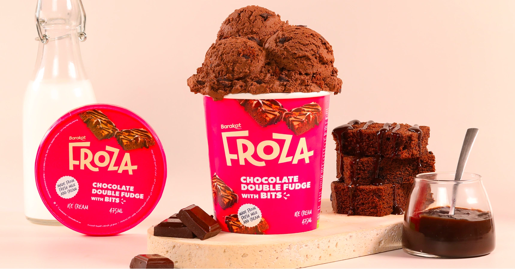
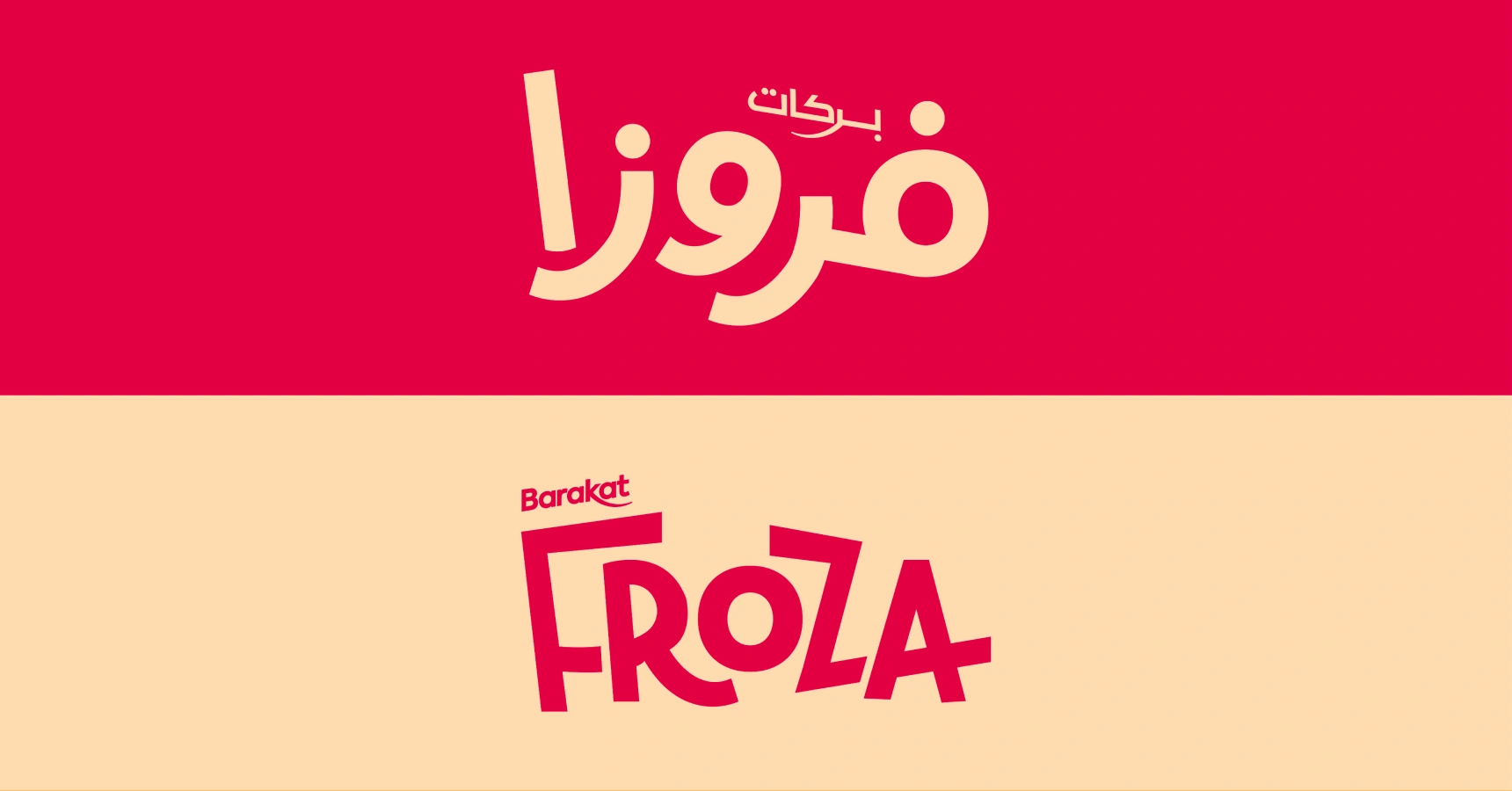
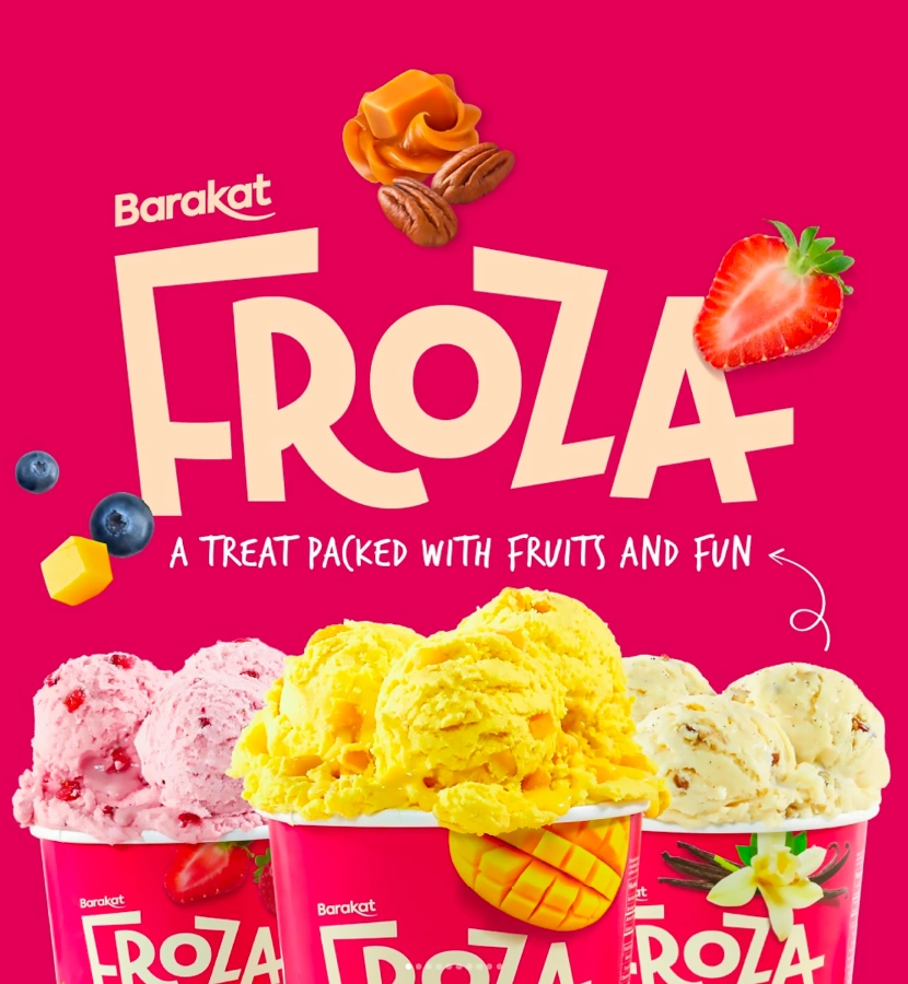
It started with the name which is a combination of ‘Frozen’ and ‘Booza’ (which means ice-cream in Arabic). Next we need to define a differentiated colour that Froza could own to have impact on shelves in the freezers and a cohesive look.
The approach
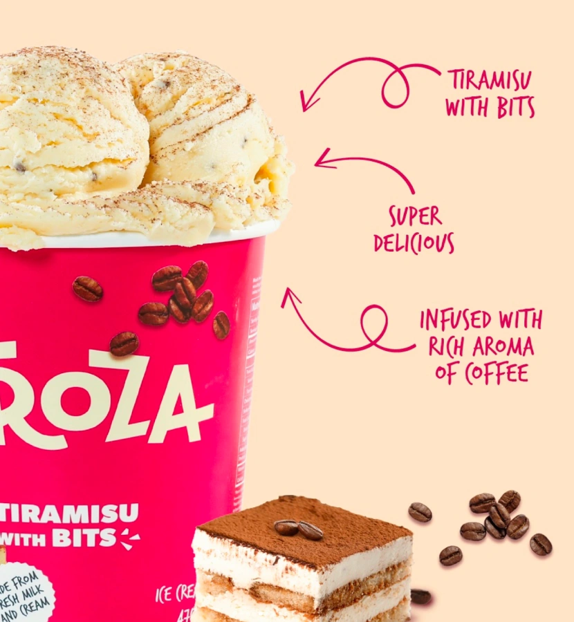
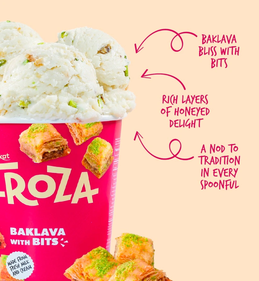
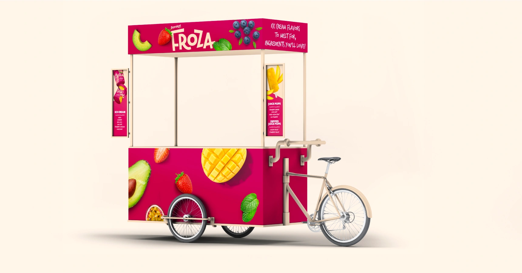
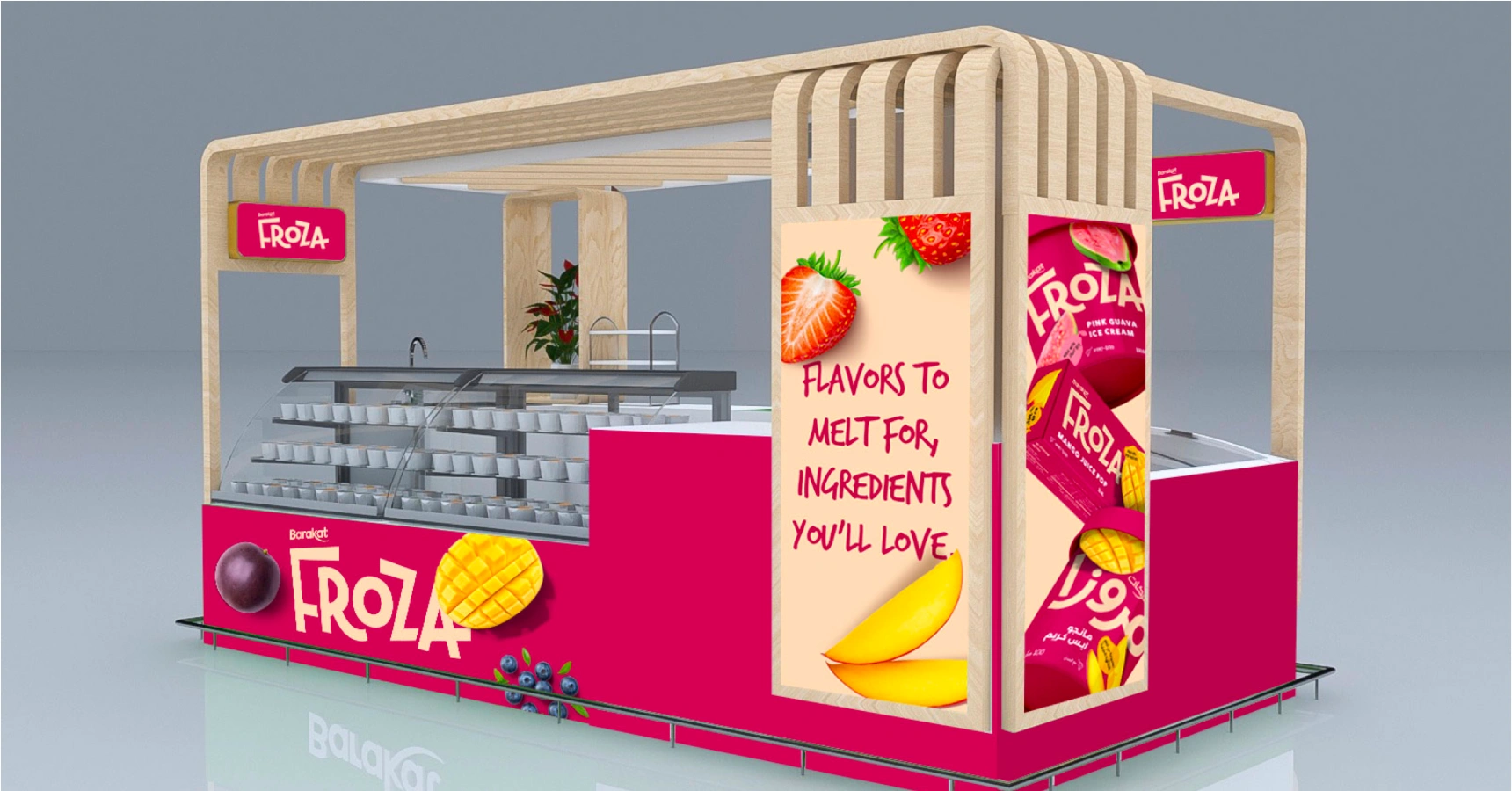
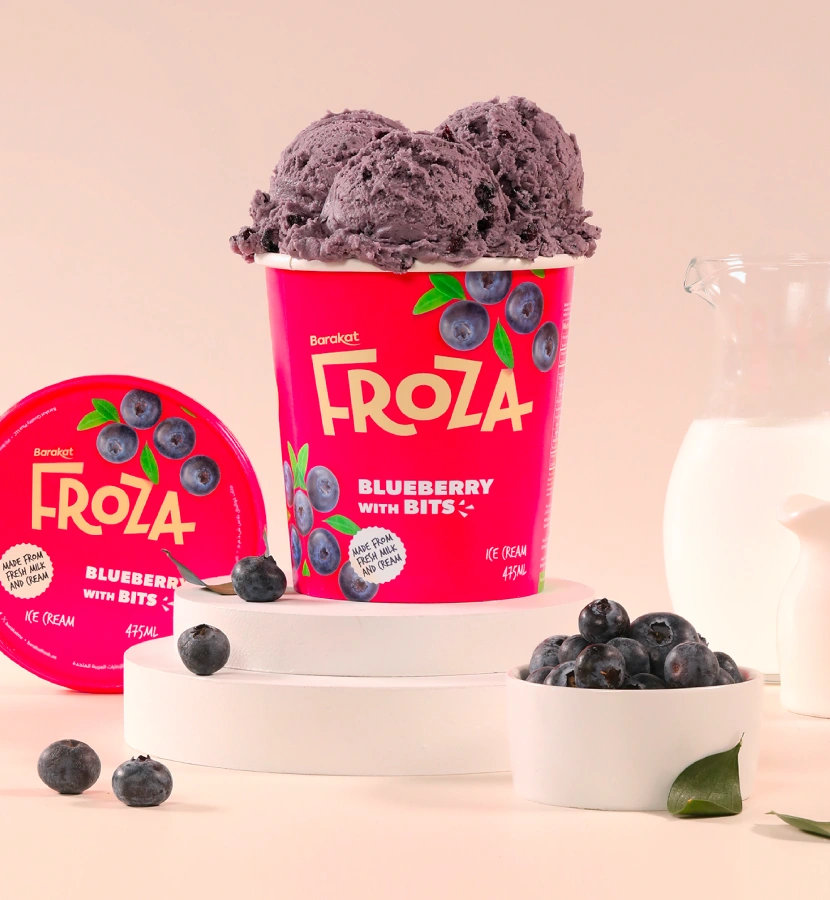
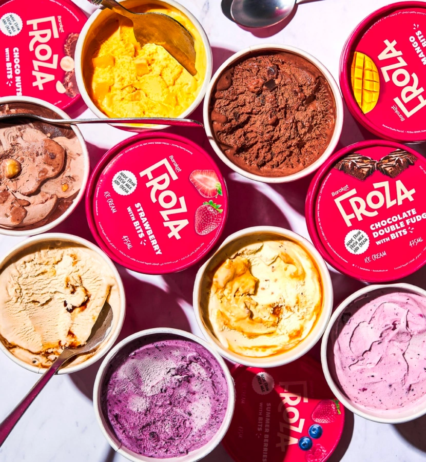
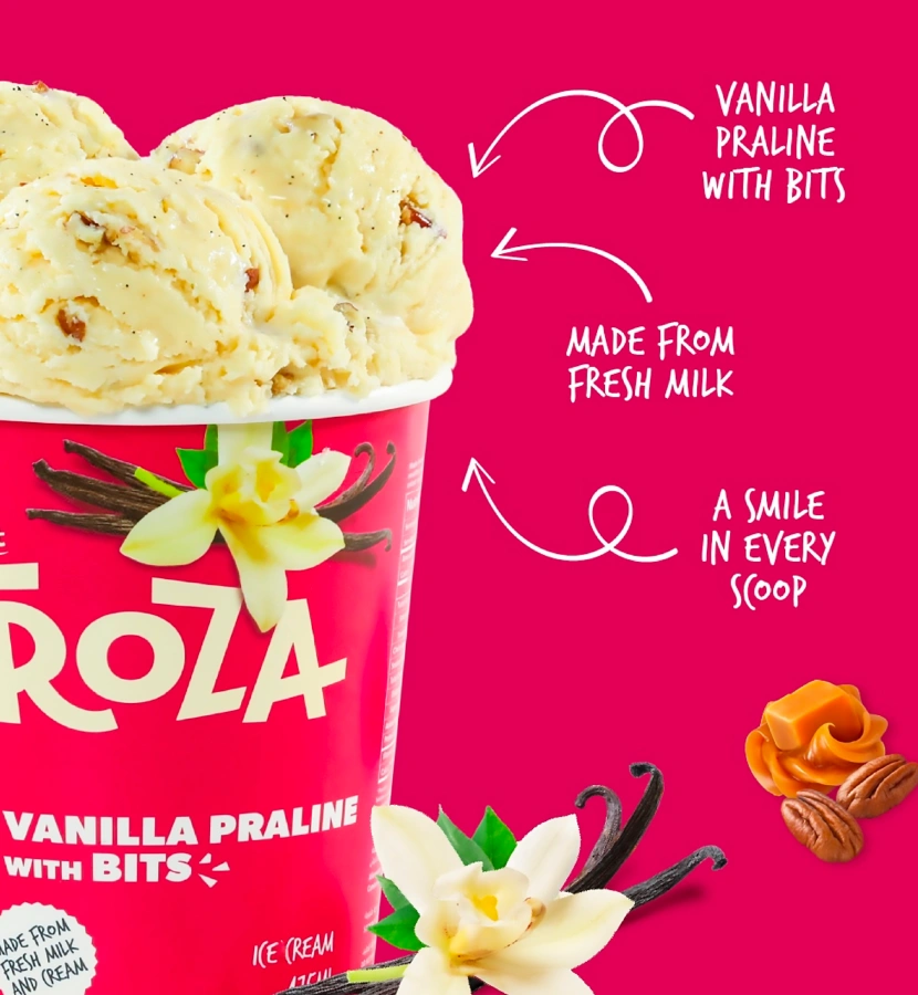
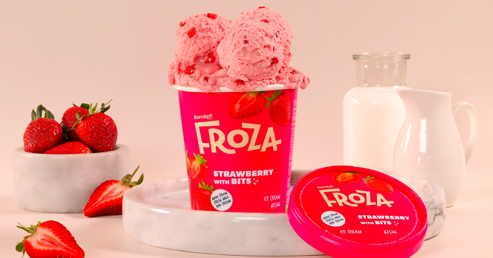
Based on the brief, we chose magenta as a brand colour for it’s boldness, it also helped Froza stand out from the sea of whites and blues on the shelves. The colour also allowed the real fruit images to stand out due to it’s contrast. With a fun and bold identity, Froza looks like a rule-breaker within the category, thus communicating how it is full of goodness and wholesomeness, compared to the guilty pleasures available in the market. Considering the audience is changing, and is seeking healthier alternatives – from product development to naming to identity and packaging, Froza answers the customers need of today.
Yellow supported the Barakat team with identity, visual language and packaging, and is so happy that Froza is being received really well in the market, and growing its loyal customer base.
